The Elements of User Experience
A summary of instructive notes based on Jesse James Garrett's "The Elements of User Experience"

This article is a summary of instructive notes based on Jesse James Garrett's book by the same title, available here.
User experience (UX) is an often neglected facet of most applications.
User-centered design takes the user into account every step of the way along the product development lifecycle.
In user-centered design,
- no aspect of the user's experience happens without your conscious intent, and
- the designer considers every possibility of every action the user is likely to take.
The most common pitfalls during UX design are:
- Design by default: The new product is complementary to an existing product, and it "defaults to" the design choices of that product.
- Design by mimicry: UX is designed by mimicking familiar conventions from other products regardless of their appropriateness.
- Design by fiat: Instead of user needs or product objectives, personal preferences drive the UX.
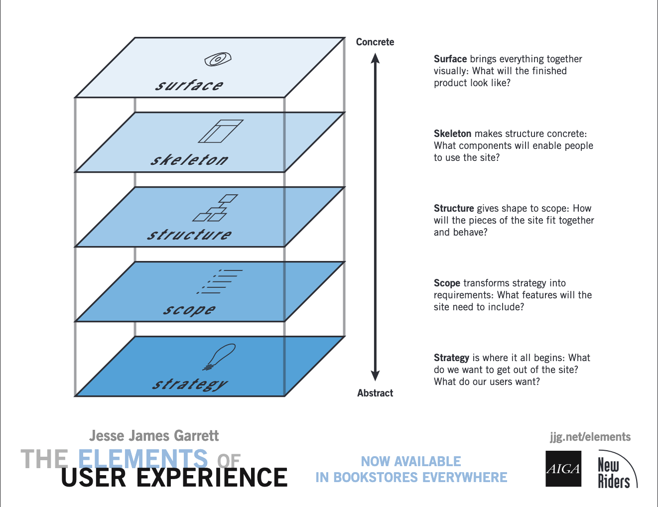
The Five Planes
It is best to begin work on a plane when ~80% through the prior plane. Decisions made in lower planes will impact possible options in higher planes.
- The Strategy, in the form of a Strategy Document
- The Scope, in the form of Functional Specifications and Content Requirements
- The Structure, in the form of Architecture Diagrams
- The Skeleton, in the form of Wireframes
- The Surface, in the form of Design Mockups

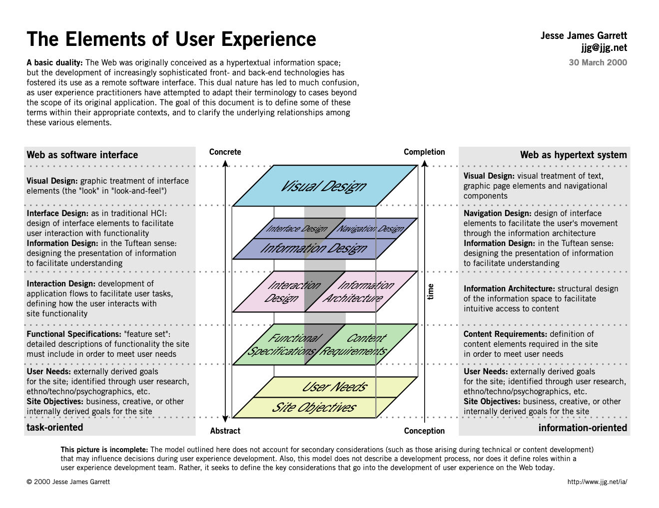
Each plane has considerations regarding functionality and information:
- Functionality: Consider the product as a tool the user employs to accomplish one or more tasks.
- Information: Enables users to find and consume the product information quickly.

These planes and their functionality and information elements are summarized below.
1. The Strategy
Why are we making this product?
What will the users get out of the site/app, e.g., buy/sell products, the role of advertising, or user-created content in the business model?
The strategy elements should be documented and maintained in a strategy document.
1.1. Product Objectives
Our objectives as the product developer.
1.1.1. Business Goals
Define the conditions for success, but not the path to get there.
1.1.2. Brand Identity
Define a set of conceptual associations or emotional reactions that interactions with the product should create.
1.1.3. Success Metrics
Define the measurable indicators to influence decisions and evidence whether the product meets its objectives and user needs.
1.2. User Needs
Goals of users outside the product organization.
- Functionality: What functionality is needed to accommodate the user's needs?
- Information: What information is needed to accommodate the user's needs?
1.2.1. User Segmentation
Define segments of users with common characteristics. These characteristics may be:
- Demographic: gender, age, education level, marital status, income, etc.
- Psychographic: attitudes and perceptions users have about the world, the functionality, and the information in the product
1.2.2. Usability and User Research
Define how to identify and test user needs. Methods include market research, contextual inquiry, task analysis, and user testing.
1.2.3. Creating Personas
Define fictional characters that represent different segments and segment cross-sections of target users.
2. The Scope
What are we going to make?
The functions and features that will be permitted by the site/app and how functions of the site fit together.
Features should be prioritized based on the priorities laid out in the strategy.
2.1. Functional Specifications (Functionality)
Functional Specifications are detailed descriptions of the feature set of the product.
- Be positive, e.g., direct user vs. disallow user.
- Be specific, e.g., videos with most views in the last week vs. popular videos.
- Avoid subjective language, e.g., hip and flashy, meet hipness expectations of X. Better to define branding guidelines and conform.
2.2. Content Requirements (Information)
Content Requirements are descriptions of the content elements of a product.
- Separate format and purpose, e.g., need FAQ vs. the need to provide users with access to commonly needed information.
3. The Structure
How do the features fit together as a cohesive whole?
The structure of the site/application and how different pages/screens are organized.
Interaction Design and Information Architectures can be expressed as diagrams based on the Visual Vocabulary.
3.1. Interaction Design (Functionality)
Which functions end up on which screens?
Interaction Design describes possible user behavior and defines how the product responds to the user.
3.1.1. Conceptual Models
Users' impressions of how the interactive components will behave, e.g., shopping cart.
3.1.2. Error Handling
- Make errors impossible, if possible.
- Make errors difficult otherwise.
- Fix errors if appropriate or handle them to give the user the choice to recover.
- Provide warnings to prevent errors if they may be irrecoverable.
3.2. Information Architecture (Information)
Information Architecture is the arrangement of content elements to facilitate user consumption based on specific aspects of what users need (strategy) and what information meets those needs (scope).
3.2.1. Structuring Content
Organizational and navigational schemes allow users to move through the site content efficiently and effectively.
3.2.2. Architectural Approaches
Architectural Approaches define the approach by which information will be organized.
- The basic unit of information is a node.
- Hierarchical structures (hub-and-spoke) have parent/child relationships.
- Matrix structures allow the user to move along two or more dimensions from node to node.
- Organic structures allow free-form exploration from node to node.
- Sequential structures are common in books, articles, audio, and video.
3.2.3. Organizing Principles
Define the criteria by which nodes will be grouped or separated.
- Organizing principles at the highest level, tied to the product objectives and user needs
- Lower levels of the architecture are influenced more by decisions specific to the content and functional requirements
3.2.4. Language and Metadata
Define a controlled vocabulary: a set of standard terms for the site, a thesaurus that maps commonly used words to the controlled vocabulary, and metadata.
4. The Skeleton
Placement of UI elements (e.g., text, buttons, controls), arranged for maximum effect and efficiency. Wireframes capture all skeleton decisions in a single document that is a reference for visual design work and site implementation.
4.1. Interface Design (Functionality)
How are functions realized on the screen?
Interface Design provides users with the ability to do things. This arrangement of interface elements enables users to interact with the feature set.
- Users immediately notice the important stuff.
- Unimportant stuff is often not there at all.
4.2. Navigation Design (Information)
Navigation design provides users with the ability to go places. This set of elements allows the user to move through the information architecture.
- Provide users with a means to get from one point to another.
- Communicate the relationship between the elements it contains.
- Communicate the relationship between its contents and the page the user is viewing.
4.2.1. Navigation Systems
- Global navigation: Across a broad sweep of the entire product
- Local navigation: Access to nearby architecture
- Supplementary navigation: Shortcuts to related content that are not readily accessible in global or local navigation
- Contextual navigation: Inline navigation for easy access
- Courtesy navigation: Access to items that users don't need regularly, provided as a convenience
- Remote navigation: Navigational devices outside the product, typically used if users are frustrated with the navigational systems provided within the product
4.3. Information Design (Functionality & Information)
Information Design communicates ideas to the user. It is the presentation of information for consumption by the user.
- Group and arrange information elements to reflect how users think.
- Wayfinding is a set of design elements that enable users to orient themselves using colors or icons, similar to parking lots.
5. The Surface
The Surface is the user interface, including text, images, and any interactive components. The considerations at the surface can be subjective. See the work of Marc Andrew for helpful guides and design systems.
5.1. Making Sense of the Senses
- Smell and taste: Choice of materials for physical products, e.g., "new car smell."
- Touch: Industrial design, materials, shape, vibrations
- Hearing: Sounds to inform the user and give personality to the product, encourage recall
- Vision: How effectively does the design support objectives of each plane? Communicate brand identity.
5.2. Follow the Eye
Where does the eye go first?
- Successful designs will have smooth eye flow. User feedback that suggests the design is "busy" or "cluttered" indicates that the flow isn't smooth.
- The surface plane should provide a guided tour of possibilities without distracting from information or functions to fulfill those possibilities.
5.3. Contrast and Uniformity
- Contrast to draw attention, e.g., brighter components for navigation
- Uniformity, e.g., same height buttons
5.4. Internal and External Consistency
- Consistent "look-and-feel" within and across other similar products
5.5. Color Palettes and Typography
- Use colors and typography effectively
- Associate colors with similar elements
- Differentiate text components with different typography
5.6. Design Comps and Style Guides
- Design composition should mirror wireframes
- Style guides enforce design consistency
